As an Amazon Associate, we earn from qualifying purchases. Some links on this site are affiliate links at no extra cost to you. Our recommendations are based on thorough research and editorial judgment.

Reading on Tablets: Best Settings for Comfort (Font, Contrast, Brightness)
When we’re reading on tablets, setting brightness and contrast just right can make a world of difference! For indoor use, we should aim for 30-40% brightness, bumping it up to 70-80% outdoors. Contrast levels between 60-70% work best in bright light, while using a font size of 125-150% will seriously boost accessibility. And don’t get me started on night mode; it’s a game changer for reducing eye strain! Stick around, and we’ll uncover even more tips for comfort.
Key Takeaways
- Set tablet brightness to 30-40% for indoor reading and 70-80% for outdoor use to enhance visibility and comfort.
- Choose a font size of 125-150% and use serif fonts like Georgia for better readability.
- Adjust contrast to 60-70% in bright light, and lower to 40-50% for children’s reading to reduce strain.
- Use night mode to minimize blue light exposure, which helps prevent sleep disruption during late reading.
- Employ ambient lighting and ergonomic positioning to improve comfort and reduce neck strain while reading.
Understanding Brightness Settings for Comfortable Reading

You may be interested


Hey there! If you’re planning to read on your tablet, getting the brightness settings just right can really make a difference in how comfortable it feels. For reading indoors, try adjusting your screen brightness to about 30-40%. This level helps reduce eye strain and keeps your eyes from getting tired. On those sunny days, though, bumping it up to 70-80% can make the text much clearer and cut down on glare.
Don’t forget about features like night mode and blue light filters. These are super helpful because they can help you sleep better by minimizing the disruption of melatonin production. If you find yourself reading for long stretches, turning off adaptive brightness lets you set a specific level that works for you, which can help prevent those pesky headaches. So, next time you’re getting cozy with your favorite book or article, remember to fine-tune those brightness settings for the best experience!
For added eye protection during outdoor reading, consider devices with UV400 polarized lenses that reduce blue light exposure and ease eye strain.
Now that we’ve got the brightness sorted, let’s chat about other ways to enhance your reading experience, like the perfect font choices or choosing the right reading app.
Recommended Products

【Android & Octa-core Processor】 Running the latest Android 13 operating system, which features enhanced privacy functions for better management of personal data and app permissions. With a wider range of customisable settings, it offers a more personalised, secure and user-friendly experience. Powered by an ultra-stable octa-core processor clocked at up to 2.0GHz, it delivers fast boot times and low-power operation. It handles multitasking with ease, ensuring a smooth user experience.

ULTRA-PORTABLE MONITOR: 15.6 Inch Full HD (1920x1080p) IPS portable monitor with a premium aluminum design, and a 60Hz refresh rate
Optimizing Fonts for Accessibility on Tablets

Hey there! You know, when it comes to reading on tablets, selecting the right fonts can really make a difference. If you bump up the font size to around 125-150%, it can seriously boost how easy it is to read. Try using serif fonts like Georgia or Baskerville—these fonts help guide your eyes along lines of text, which is especially handy during those long reading sessions!
For anyone who has dyslexia, using a font designed for better recognition, like OpenDyslexic, can really help reduce fatigue. It’s all about making the text more approachable, and this small change can make reading feel a lot less tiring.
Another tip: play around with line spacing. Setting it to about 1.3 to 1.5 times the font size creates a bit more breathing room between lines, making everything a whole lot easier to read. So, why not tweak your font settings a bit? It’s all about creating a reading experience that’s more comfortable and friendly for your eyes. Up next, let’s explore some more features you can adjust to enhance your tablet reading! Adding blue light protection features can further reduce eye strain during extended reading sessions.
Recommended Products


Amazon Kindle Scribe (16 GB) the first Kindle and digital notebook, all in one, with a 10.2” 300 ppi Paperwhite display, includes Basic Pen
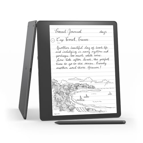
Like-New Amazon Kindle Scribe (16 GB) is refurbished, tested, and certified to look and work like new and comes with the same limited warranty as a new device. Like-New Amazon devices may be packaged in generic Amazon-branded boxes.
Enhancing Contrast for Better Tablet Reading Visibility

You know, after we’ve smoothed out our fonts for easier reading, let’s chat about another big player—contrast settings. Adjusting the contrast on your tablet can really boost how clearly you see the text. For reading during the day in bright light, a contrast ratio of about 60 to 70% is usually spot on. But when it comes to our little ones, it’s better to dial it down to around 40 to 50% to keep things comfortable for their eyes.
Now, if you’re in a medical setting where reading complex texts is a must, higher contrast levels make a big difference. Think of how reading a prescription or medical report becomes clearer with those bold distinctions. Plus, using the auto-brightness feature can really help with lighting changes around you, so your screen adjusts automatically. If you have specific preferences or needs, don’t forget about those third-party apps. They can give you tailored options without breaking the bank. So, we’ve got plenty of ways to enhance our reading experience and protect our eyes!
Pairing these settings with blue light blocking glasses can further reduce eye strain and improve reading comfort on tablets.
Recommended Products

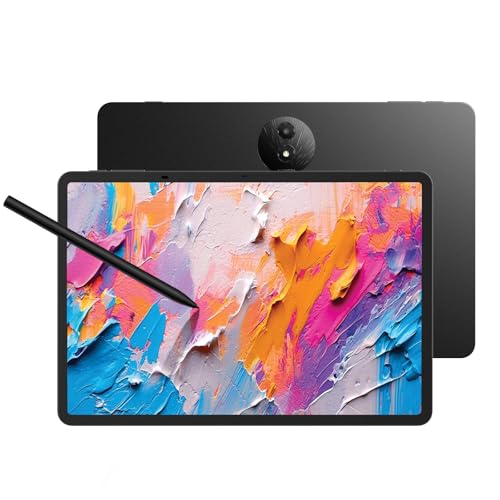
Tablet, Drawing Pad, Digital Notebook & Musician Tablet – All-in-One: The TCL NXTPAPER 14 combines creativity, productivity, and entertainment in a single device. Its 14.3" 2.4K screen and 4096-level T-PEN stylus make it easy for students, artists, musicians, and everyday users to draw, take notes, read, view sheet music, and enjoy media

4K CLARITY FOR CREATIVE EXCELLENCE: 27" UHD (3840 x 2160) display delivers ultra-sharp visuals and fine detail for designers, photographers, and video editors

【Revolutionary Wireless Portable Monitor】 Wirelessly cast 1080P FHD visuals to an anti-glare IPS matte screen with 100% sRGB, 8-bit color, 400 nits brightness, and a smooth 60Hz refresh rate. Thanks to advanced wireless technology (AirPlay & Miracast), you can connect directly to Windows, macOS, Android, iPhone, iPad, MacBook, and PCs — no cables, no limits. Note: Extend mode requires manual setting on computers; phones and tablets only mirror.
Benefits of Night Mode for Comfortable Reading?
Hey, have you ever tried using night mode for reading? It’s pretty amazing how it can totally change the way you experience a book or an article at night. You know how bright screens can strain your eyes, especially when the lights are dim? Night mode comes to the rescue with its dark backgrounds and light text, making it way easier on your eyes.
Plus, did you know that using night mode helps cut down on blue light exposure? That stuff can really mess with your sleep if you’re reading right before bed. I’ve found that switching to night mode makes a huge difference; I don’t feel as fatigued after a long reading session. Many reading apps even let you adjust the brightness and contrast to fit your preferences. For example, you can increase the warmth of the colors to make the text even softer on your eyes. For even better protection, consider pairing night mode with blue light blocking glasses to reduce eye strain and improve comfort.
Recommended Products


TAHOE EDITION: Inspired by crystal-clear water of Lake Tahoe, these GUNNAR glasses represent the pinnacle of engineering and the best optical materials on the market

GUNNAR produces the only blue light blocking computer and gaming glasses with Patented Lens (#9417460) Technology that is recommended by doctors to protect and enhance your vision.
Recommended Apps for Comfortable Tablet Reading
If you’re looking for an enjoyable reading experience on your tablet, the right app can make all the difference. Apps like Moon+ Reader and Kindle are fantastic for this—they let you adjust the brightness and even change the font to suit your taste. Plus, they come with night mode features, which can really help reduce eye strain if you like to read for long periods, especially at night.
Another great option is Libby. It’s perfect for borrowing library books, and it makes reading even sweeter with adjustable font sizes and background color options—so you can customize your reading experience just the way you like it. And don’t overlook Google Play Books! It not only syncs your books across devices but also offers tons of formatting choices to match your style.
Many of these reading apps also come with built-in blue light filters and dark modes. This means you can comfortably read in low light without worrying about straining your eyes. Finding an app that suits your reading habits can truly enhance your experience, making it much more enjoyable. Now, let’s explore a few more features that can take your digital reading to the next level! Using blue light blocking glasses with these apps can further protect your eyes and reduce fatigue during long reading sessions.
Recommended Products
Tablet, Drawing Pad, and Digital Notebook — All in One: Designed for artists, students, professionals, and entertainment users, the TCL NXTPAPER 11 Plus seamlessly fits into your daily routine. Equipped with an 11.5" 120Hz 2.2K display, it delivers smooth visuals and crisp clarity, while the TCL T-PEN stylus with 4096 pressure levels ensures precise and natural input for writing, sketching, or note-taking

【Android 16 Tablet with Gemini AI 3.5】The 11 inch TABWEE T90 brings a cleaner, smarter tablet experience for work, study and home use. Android 16 adds a simpler lock screen, customizable Quick Settings, improved video calls with background blur and portrait light, easier cloud photo selection and enhanced Linux terminal support. With Gemini AI 3.5, you can search, translate, summarize notes, organize ideas and plan tasks more efficiently—ideal for online classes, reading, video calls and light office work

【Android 16 & Gemini AI — Smarter, Faster, and Future-Ready】This P10 PRO android 16 tablet adopts the latest Android 16 system and built-in Gemini AI to deliver smoother operation than old Android 15 tablets; it supports instant translation, intelligent office and learning assistance, and lag-free multitasking. As a high-performance gaming tablet, it upgrades overall privacy, security and running speed to meet diversified daily demands. Ideal for students, office workers and family users to browse web, stream videos and boost daily productivity, this tablet 10 inch brings more intelligent and convenient using experience for long-term daily use.
Effective Strategies to Minimize Eye Strain During Reading
Hey there! If you’re like me and love curling up with a good book on your tablet, you’ll want to make sure you’re avoiding eye strain. It can really dampen the reading experience, right? To keep those peepers happy, start by adjusting your tablet’s brightness. In a dim room, aim for around 30-50%, but if you’re outside in the sun, crank it up to 70-80%.
Another cool tip is to use Dark Mode, which really helps cut down on glare from the screen. Plus, try this neat little trick called the 20-20-20 rule: every 20 minutes, just look away from your screen at something about 20 feet away for 20 seconds. It’s like a mini break for your eyes!
When it comes to fonts, go for serif types—they’re easier on the eyes. Try adjusting your contrast to somewhere between 40-70% to find what feels best for you. These simple tweaks can make a big difference in how enjoyable your reading sessions are. So, with these helpful tips in your back pocket, you’re all set to turn the page comfortably! Now, let’s chat about how to create the perfect reading environment.
Creating a Cozy Reading Environment for Tablets
Creating a cozy reading environment for our tablets can really make a difference in how much we enjoy our reading! For starters, I always keep my screen brightness between 30-50% when I’m in low light. It’s a simple trick that really helps reduce eye strain, especially when I switch to dark mode or use sepia backgrounds in my reading apps. Isn’t it neat how such small tweaks can boost our comfort?
Another tip is to use a stand to elevate my tablet to eye level. This makes a huge difference for my posture—no more neck strain after those long reading sessions! And while we’re at it, it’s worth experimenting with different fonts. I find that serif fonts like Georgia or Baskerville are much easier on my eyes when I bump up the size a bit.
Lastly, think about your ambient lighting. Good lighting softens the contrast between the tablet and your surroundings, making everything feel warmer and more inviting. You might want to try a soft lamp or even some fairy lights to create that perfect vibe. With these little adjustments, your reading time could feel like sinking into a favorite cozy nook. What do you think? Ready to transform your reading space?
To further reduce eye strain during long reading sessions, consider wearing blue light glasses that block harmful screen light and improve comfort.
Tips for Extending Battery Life While You Read
Hey there! You know, if you’re sinking into a good e-book on your tablet, there are some easy tweaks to extend your battery life. For starters, try lowering your brightness to about 30-40%. Not only does this cut down on power usage, but it also helps reduce any glare from the screen, making it way more comfortable to read for longer periods.
Another tip? If your tablet has an OLED screen, enable dark mode. Those darker pixels use less energy, so you’ll get more reading time before needing a charge. Plus, don’t forget to close any extra apps running in the background. This helps your device conserve resources, which is especially handy if you like to read without interruptions.
And here’s a savvy idea: when you’re not using the internet, switch on airplane mode. It’s a simple way to save battery and focus on your book without distractions. Organizing your files and offloading some stuff onto an SD card can lighten the load on your internal storage too. Using blue light glasses with magnification can also help reduce eye strain during extended reading sessions. With these tips, you’ll be all set for a cozy reading session! Happy reading, and let’s explore some great e-books next!
Caring for Your Tablet to Enhance Reading Experience
Hey there! You know, while it’s easy to just focus on what we’re reading on our tablets, keeping our device in great shape can actually make a big difference in our reading experience. For starters, regularly cleaning the screen with a microfiber cloth can really boost visibility and help reduce eye strain. It’s a quick and simple task, but it can save your eyes from a lot of discomfort! If you often find yourself battling glares, consider slapping on a matte screen protector—it makes a world of difference when the lighting isn’t perfect.
And let’s not forget about keeping our tablets protected. A sturdy case is a smart investment to guard against those accidental drops or bumps. If you ever find your tablet getting sluggish, make sure to update the software. New updates often bring cool features that can enhance your reading comfort. Plus, organizing your reading library—like creating folders for different genres—can help you find what you want to read right away instead of sifting through a chaotic list.
Also, consider using blue light blocking glasses to reduce eye strain during extended reading sessions on your tablet.
Frequently Asked Questions
What Is the Best Display Setting for Reading?
When it comes to the best display setting for reading, we should embrace a cozy ambiance by using night mode, adjusting font sizes and background colors, ensuring screen resolution and text alignment enhance our reading experience while minimizing eye strain.
What Is the Best Screen Brightness and Contrast for the Eyes?
For ideal comfort, we should adjust brightness levels to match ambient lighting, using warmer color temperatures and night mode to reduce blue light. Keeping contrast at 30-40% minimizes screen glare and eye strain. Font size matters, too!
Which Mode Is Best for Reading?
We prefer dark mode for reading, immersing ourselves in a soothing nebula while minimizing glare reduction. The white background can cause eye strain, but thoughtful font styles and color temperature can combat reading fatigue beautifully.
How to Make a Screen Better for Reading?
To make a screen better for reading, we should reduce screen glare, choose ideal font size and background color, maintain proper reading distance, use blue light filters, and adjust text spacing for comfort and eye strain prevention.


