As an Amazon Associate, we earn from qualifying purchases. Some links on this site are affiliate links at no extra cost to you. Our recommendations are based on thorough research and editorial judgment.
Brightness vs Contrast: Which Setting Matters More for Eye Comfort?
When it comes to eye comfort, we can’t overlook the balance between brightness and contrast. Too bright or too dark can lead to strain. Ideally, we should adjust brightness to 120-350 cd/m², depending on room lighting, and maintain a contrast ratio of 3:1 to 5:1. This way, we can avoid squinting and fatigue during long screen sessions. Understanding these settings is mind-blowing! Want to keep your eyes happy and learn tips for adjustment? Let’s explore further!
Key Takeaways
- Optimal brightness levels range from 120 to 350 cd/m², depending on ambient lighting conditions, ensuring comfort while viewing screens.
- Maintain a contrast ratio of 3:1 to 5:1 for clarity, enhancing both image quality and text visibility during prolonged use.
- Adjust brightness and contrast together to prevent eye strain, as improper settings can lead to digital eye fatigue.
- Use the 20-20-20 rule to reduce eye fatigue, taking breaks every 20 minutes to look at something 20 feet away.
- Consider warm tones after sunset to lower blue light exposure, promoting overall eye comfort and sleep quality.
What Is the Relationship Between Brightness and Eye Comfort?
You may be interested


You know, when we think about how our screens look, we often forget how much brightness and contrast can affect our eye comfort. Ideally, the brightness level should sit between 120 to 350 cd/m², and it’s super important that it matches the lighting in your room. If your screen is way too bright or dim compared to your surroundings, your eyes can really take a beating, especially if you’re staring at it for hours.
Now, let’s break down contrast a bit. A good contrast ratio of about 3:1 to 5:1 helps us read text without straining our eyes, which is crucial for avoiding that annoying digital eye fatigue. Imagine trying to read a gray text on a white background—that’s tough on the eyes! Conversely, if you have high contrast in a dimly lit room, it can make you squint as if you just saw a plot twist in a tense movie. So, finding that right balance in brightness and contrast is key for a comfortable viewing experience.
Want to make sure you’re set up comfortably? Take a moment to adjust your screen’s brightness to match the room lighting, and find a contrast setting that makes reading easy on your eyes. Trust me, your eyes will thank you! Using blue light glasses can further enhance your viewing comfort by reducing eye strain caused by prolonged screen time.
Why Contrast Settings Matter for Visual Clarity
Hey there! Have you ever fiddled with the contrast settings on your screen? Trust me, it can really change how clearly you see text and images. When you adjust the contrast, you’re basically making it easier for your eyes to tell the difference between the text and the background. For instance, a good rule of thumb is to aim for a contrast ratio of 3:1 when you’re editing documents. If you’re working with visuals, bump it up to 5:1 to keep everything crisp and clear without any blurry text.
Think about it: when the contrast is just right, you reduce the chances of squinting and that annoying eye strain that comes from staring at a screen for too long. It’s all about making your screen time more comfortable, especially if you’re working in different lighting, like switching from a bright office to a cozy nook at home. So, taking a couple of minutes to adjust your settings can be a simple way to make your experience much more enjoyable. And who wouldn’t want that?
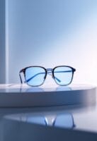
Using gaming glasses that filter blue light can further reduce eye strain and improve comfort when you’re spending long hours in front of screens.
Next time you sit down to work or relax with a good show, give those contrast settings a little tweak. Your eyes will thank you!
Finding Ideal Brightness and Contrast for Different Settings
Finding the right brightness and contrast for your screen can really feel like an art form, don’t you think? It plays a huge role in how comfy our eyes are during screen time. If you’re working in a bright room, you’ll want to crank the brightness up to about 250 to 350 cd/m². But in a dim setting, dial it down to around 120 to 180 cd/m². Trust me, your eyes will thank you for that!
Now, let’s chat about contrast. Think of it like a recipe: you want a mix that’s just right, ideally around a 3:1 to 5:1 ratio. This sweet spot helps make text pop and saves you from squinting at your screen. For instance, if you’re reading a book or working on a report, higher contrast will make the text clearer and easier to digest.
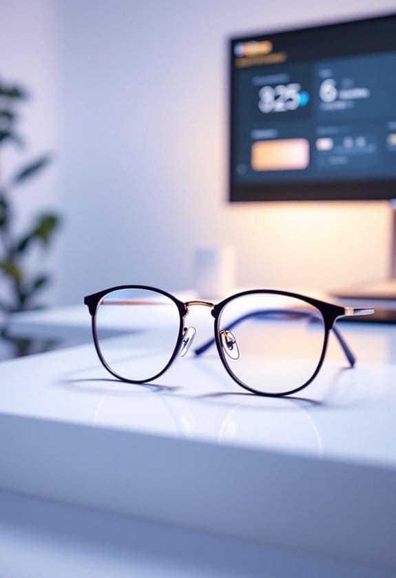
Another tip? In the evenings, switch to warmer color tones to cut down on blue light. This small adjustment can work wonders for reducing eye strain and getting you into a comfy mindset for winding down. So, keep an eye on those settings based on the light around you, and you’ll enhance your viewing experience tremendously! It’s all about finding that balance that keeps your eyes happy and healthy. For even better eye comfort, consider using blue light blocking glasses to filter out harmful light during extended screen use.
Recommended Products


TAHOE EDITION: Inspired by crystal-clear water of Lake Tahoe, these GUNNAR glasses represent the pinnacle of engineering and the best optical materials on the market

GUNNAR produces the only blue light blocking computer and gaming glasses with Patented Lens (#9417460) Technology that is recommended by doctors to protect and enhance your vision.
Easy Tips for Comfortable Screen Contrast Adjustments
Hey there! Have you ever thought about your screen’s contrast settings? It may not seem like a big deal, but getting those adjustments just right can really boost your eye comfort. Ideally, you want a contrast ratio between 3:1 and 5:1. This makes it easier to read text and see images while keeping strain on your eyes to a minimum. A good rule of thumb is to set your contrast level around 60-70%, especially if you’re staring at the screen for long periods.
Speaking of eye comfort, you might want to keep the 20-20-20 rule in mind. This means every 20 minutes of screen time, take a quick break and focus on something 20 feet away for a minute. It really helps refresh those tired eyes! Plus, don’t forget that your screen settings can depend on your room’s lighting. If you’re in a bright space, you’ll want to crank up that contrast for better visibility. And if you find yourself struggling with glare, consider getting an anti-glare filter—these can really help reduce distractions! Wearing anti-glare glasses can further protect your eyes by filtering out harmful blue light and reducing strain during extended screen use.
Recommended Products

【True All-in-One Smart Board for Modern Workspaces】NewBoard P Series integrates display, 4K camera, microphone array, speakers and Android 14 system into a single streamlined device, eliminating the need for external PCs, webcams or conference equipment. Designed for conference rooms, classrooms and hybrid collaboration spaces, it delivers seamless video meetings, wireless casting, interactive whiteboarding and enterprise app access in one professional solution.

[AI-POWERED PRODUCTIVITY] - Elevate your workflow with the revolutionary Copilot+ PC experience. Driven by the AMD Ryzen AI 7 350 processor and a dedicated Microsoft Copilot key, this HP All-in-One desktop delivers blazing-fast AI processing, intelligent assistance, and the HP AI Companion to maximize your daily efficiency

DELL USA AUTHORIZED - Includes Full DELL USA WARRANTY | Dell UltraSharp U3824DW 38" 3840x1600 60Hz 21:9 5ms IPS Curved Monitor
How Ambient Lighting Affects Your Screen’s Brightness and Contrast
You know, when it comes to screen brightness and contrast, we usually think about tweaking the settings on our devices, right? But the truth is, the ambient lighting around us has a huge impact on how we see those settings. For example, if you’re in a well-lit room during the day, you might need to crank up your screen brightness to combat the glare so you can read everything clearly. On the flip side, when the lights go down, turning down that brightness can make things much more comfortable for your eyes—no more squinting!
And let’s not skip over contrast; it’s a big player in making sure what’s on your screen is easy to read. A good rule of thumb is to aim for a contrast ratio between 3:1 and 5:1. This helps keep text crisp and images sharp. So, as you’re adjusting your monitor, try syncing those changes with the natural light around you. This little habit could help prevent digital eye strain and make your screen time so much more enjoyable. Isn’t it cool how a little change in environment can make such a difference? Using blue light blocking glasses can further reduce eye strain caused by prolonged screen exposure.
Recommended Products

Bright — ideal for a variety of lighting conditions, the projector has: Color Brightness: 3,000 lumens (1) and White Brightness: 3,000 lumens (1).
Bright ideal for a variety of lighting conditions, the projector has 2,500 lumens of equal color and white brightness (1)

With a breathtaking screen size of up to 140 inches, the ceiling-mountable HU70LAB delivers 4K UHD resolution, leveraging XPR* with 8.3 million pixels (3840 x 2160), four times the resolution of Full HD
The Impact of Poor Brightness and Contrast on Eye Strain
Hey there! You know those moments when you’re staring at your screen and your eyes start to feel like they’re on fire? That often comes from poor brightness and contrast settings, which can really be a hassle for our eyes. If your screen’s too bright or too dim, it’s a recipe for digital eye strain. Ideally, you want to set your brightness to about 100-300 cd/m², depending on how much light is in the room. Trust me, your eyes will thank you!
Now, let’s talk about contrast. Having a good contrast ratio, ideally between 3:1 and 5:1, is super important for keeping everything clear and easy to read. Imagine trying to read a book with fuzzy text; pretty annoying, right? That poor contrast can not only lead to blurred text but also make your eyes work harder, which means more fatigue. So when you adjust those settings, think of it as giving your eyes a much-needed break. To further protect your eyes from strain, consider wearing blue light safety glasses that filter harmful light emitted by screens.
Recommended Products

Benefits: Wear Sunset Lenses between sunset and bedtime. Experience newfound relaxation in the evening, fall asleep more easily, sleep more deeply, and wake up with more energy. Customers who wear sleep tracking devices consistently report significant improvements in their sleep scores when wearing Ra Optics.

Benefits: Wear Daylight Lenses whenever you are exposed to man-made light sources during the day, whether you are on the computer, at the office, or at school. Eliminate eye strain, headaches, and afternoon fatigue. Calm your mind, boost your focus, and increase your productivity.

ADVANCED SLEEP TECHNOLOGY: Blocks 98% of sleep-disrupting blue, green, and violet light wavelengths from digital screens and artificial lighting, allowing natural melatonin production for deeper, more restorative sleep.
Practical Tips for Adjusting Brightness and Contrast to Enhance Eye Comfort
Hey there! If you want to keep your eyes comfortable while you’re glued to your screen, it’s important to adjust your brightness and contrast settings like a pro. Start by matching your screen brightness to the ambient lighting around you. For instance, if you’re in a bright room, aim for about 250 to 350 cd/m², but if you’re in a cozy dim space, you can dial it down to around 120 to 180 cd/m². This small tweak can make a huge difference in how your eyes feel!
Now, let’s chat about contrast. Ideally, you want a contrast ratio between 3:1 and 5:1. This range helps make text clear and easy to read without straining your eyes. Speaking of text, try to keep your font size at least 16px. It’s a simple fix that can really help minimize squinting.
Another tip? When the sun goes down, switch to warmer tones on your screen. Warm colors can help reduce blue light exposure and might just help you sleep better at night. And don’t forget the 20-20-20 rule—every 20 minutes, turn your gaze to something at least 20 feet away for about 20 seconds. Your eyes will appreciate the break!
For added protection, consider using blue light glasses to block harmful rays and reduce eye strain during extended screen use.
These small adjustments can really enhance your comfort while using screens. Next up, let’s explore how other screen settings can impact your visual experience.
Recommended Products

✅Eyes Moisturizing Effect : Our glasses adds a physical moisturizing silicone ring to slow down the evaporation of moisture in the eyes and effectively solve the problem of dry eyes.The humidity and temperature of the water box can be adjusted by filling the reservoir with water, heating and freezing the Tourmaline.

TRANSFORM YOUR SLEEP & HABITS: The Hack Your Sleep Bundle. Say Goodbye to Sleepless Nights and Bad Habits. Are you struggling with poor sleep and unproductive habits? Our exclusive bundle combines the transformative power of Swanwick Sleep’s Night Swannies and the ‘47 Day Habit Hacker’ program.

Frequently Asked Questions
What Brightness and Contrast Settings Are Best for Eyes?
For eye comfort, we should adjust brightness levels to match ambient lighting and set contrast levels between 3:1 to 5:1. Regular display calibration and color temperature changes minimize screen glare and visual fatigue.
Should Contrast Be Set Higher Than Brightness?
Yes, we should set contrast higher than brightness. This contrast adjustment boosts visual clarity without screen glare, adapting to ambient lighting, enhancing our user experience and addressing color saturation for improved digital ergonomics, especially for those with eye sensitivity.
Does Brightness or Contrast Help Eye Strain?
Both brightness and contrast greatly affect eye strain. We’ve found that adjusting brightness for ambient lighting, coupled with ideal contrast levels and ergonomic positioning, enhances visual comfort on digital screens. Color temperature and screen filters also help.
Which Is Better Brightness or Contrast?
When it comes to eye comfort, we find that both brightness adjustments and contrast effects are essential. Matching screen settings to ambient light enhances visual clarity, catering to personal preferences for long-term usage on digital devices.


