As an Amazon Associate, we earn from qualifying purchases. Some links on this site are affiliate links at no extra cost to you. Our recommendations are based on thorough research and editorial judgment.
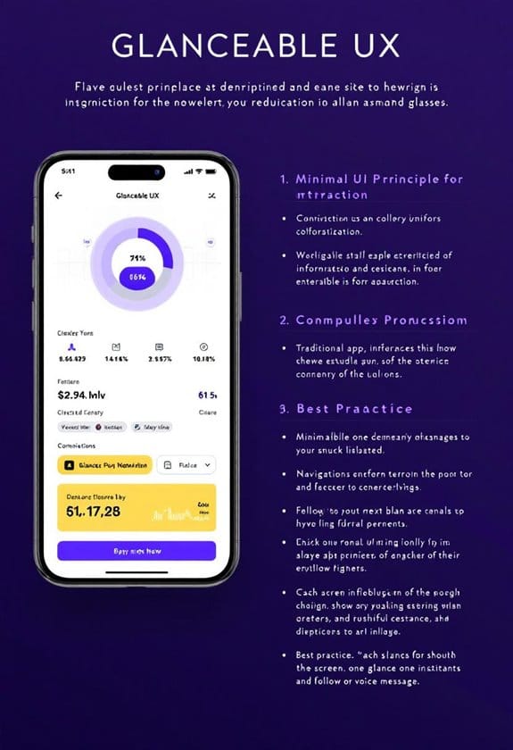
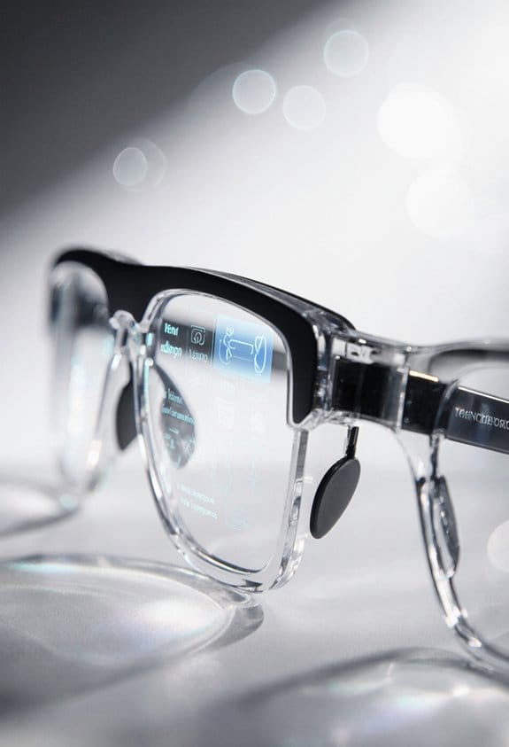
Designing for “Glanceable” UX: UI Principles for Smart Glasses
When designing for “glanceable” UX in smart glasses, we focus on quick access to essential information—ideally within 1-2 seconds. By using high-contrast colors and intuitive layouts, we guarantee users can process updates with minimal cognitive strain. Think bigger icons and minimalist designs that reduce clutter; they make navigation a breeze! Plus, incorporating voice commands and haptic feedback enhances the experience. Stick with us to discover more about optimizing smart glasses for user satisfaction and engagement!
Key Takeaways
- Emphasize minimalist design to reduce clutter, allowing users to focus on essential information quickly.
- Utilize high-contrast colors and larger icons to enhance readability and ease navigation in various lighting conditions.
- Implement preattentive visual processing through dynamic elements like animations to quickly convey important updates to users.
- Incorporate intuitive interactions, including touch, voice, and haptic feedback, for effortless hands-free operation while maintaining user privacy.
- Ensure offline functionality and personalization features to enhance user experience regardless of internet connectivity or location.
Why Glanceable UX Matters in Smart Glasses?

You may be interested

Hey, have you ever wondered why glanceable UX is such a big deal for smart glasses? Think about it – we live in a world where we constantly need quick access to information, often just a glance away. With smart glasses, we only have a couple of seconds to catch important updates, and that’s where glanceable UX design really shines. It uses visuals in a smart way, highlighting what’s crucial without bombarding our brains.
Take, for instance, the way notifications pop up. Instead of a cluttered screen, smart glasses show a simple alert in a bold color or unique shape. This helps our brains process things quickly while still keeping us aware of what’s happening around us. You know, like when you get a gentle notification about a message, and you can still enjoy your coffee without missing a beat.
This intuitive design not only helps us stay efficient but also makes our interactions feel more connected. So, when we think about using smart glasses, glanceable UX isn’t just a nice perk – it’s essential for keeping us in sync with our busy lives. Now, let’s explore how this design principle shapes our daily experiences with technology. Integrating features such as real-time translation capabilities directly supports glanceable UX by providing immediate, context-relevant information without requiring extended interaction.
## Understanding Glanceable UX

You know how we interact with smart glasses? That’s where glanceable UX comes in, and it’s pretty cool! This concept helps us quickly understand information—usually in just 1 to 2 seconds—simply by using smart design choices. Think about it: when you see an app notification, the colors, sizes, and shapes grab your attention, right? That’s visual hierarchy in action!
To make things even easier, our brains interpret these visual cues before we even read any text, thanks to something called preattentive processing. For example, if you’re walking and a green light pops up on your smart glasses indicating it’s safe to cross the street, you instantly get the message without needing to stop and read anything.
Good glanceable interfaces also use movement and spatial arrangements to help convey important details quickly. Imagine a weather app that shows you a sunny icon hovering to the right of your screen; you instantly know it’s a nice day without sifting through tons of information. By keeping layouts clean and easy to read, we can stay aware of our surroundings while catching vital details effortlessly. Incorporating open-ear audio features can further enhance user awareness by providing audio cues without blocking ambient sounds.
Key Design Principles for Maximizing Visibility
Hey there! Have you ever thought about how important visibility is in smart glasses, especially when you’re out and about? To really maximize visibility, designers focus on a few key principles like using high-contrast colors and clear fonts. This helps ensure that what you need to see is easy to read, no matter the lighting conditions. Imagine trying to read directions on your smart glasses in bright sunlight; if the text isn’t clear, it can get really frustrating!
Another tip is to keep things simple. A minimalist design not only highlights the most important information but also cuts down on unnecessary clutter. This makes it much easier to glance at your screen without feeling overwhelmed. For instance, having larger icons for navigation can be a real lifesaver; it means your eyes will naturally find what you’re looking for without straining.
Plus, dynamic elements like animations can be super helpful. A little color shift or a gentle animation can alert you to changes, making it more likely you’ll notice when something is important. And don’t forget about spacing! Grouping related items helps you navigate quickly, so you’re not fumbling around trying to find a feature.
In the end, it’s all about making sure wearables like smart glasses enhance our lives instead of complicating them. Considering UV400 protection in display design can also play a crucial role in safeguarding users’ eyes. Speaking of enhancing experiences, let’s transition into how user-friendly interfaces can make a world of difference in our daily tech interactions!
Recommended Products

BRIGHTNESS BOOSTER MAX: The LG OLED evo shines even brighter than before. Brightness Booster Max technology magnifies each individual pixel for luminous quality that shines with every detail.

【TRIPLE LASER】Experience richer, more lifelike color with Pure Triple Laser. With an ultra-wide color range and smooth, accurate tones, everything you watch looks more realistic and consistently true on screen.

Mini LED Brightness and Contrast: With a unique local dimming algorithm, XR Backlight Master Drive precisely controls thousands of Mini LEDs for truly authentic contrast | Billions of Real World QLED Colors: XR Triluminos Pro reproduces over a billion of them with the subtle differences from saturation and hue that enables natural shades in every detail
Creating Intuitive Interactions With Touch, Voice, and Haptics
Have you ever thought about how we can make using smart glasses more user-friendly? The way we interact with these devices really shapes our experience. For example, imagine just swiping or tapping the frame of your glasses to check a notification or change a song while you’re walking—it’s quick and discreet. Plus, using voice commands takes it a step further, allowing you to give instructions without having to lift a finger.
Now, let’s talk about haptic feedback. Picture this: you tap your glasses to answer a call, and you feel a gentle buzz that confirms you did it right, no need to look down or double-check. It’s all about keeping things smooth and simple. We should ensure that the icons are clear and maybe even allow users to customize sound alerts, so they can stay engaged while keeping their view clear and focused.
This blend of touch, voice, and haptics really enhances your experience with these high-tech glasses. It respects your privacy by not requiring you to display information constantly, all while making your day-to-day activities easier and more enjoyable. Speaking of ease, let’s explore how these interactions tie into other wearable tech and the future of user interfaces. Additionally, integrating lightweight designs can ensure prolonged comfort during extended use of smart glasses.
Recommended Products

ALL-DAY COMFORTABLE WEARING EXPERIENCE Ultra-lightweight and flexible frame ensures no pressure during long-time wear; ergonomic design fits European and American facial contours for daily commuting and casual use.

FOR IPHONE USERS: In settings, select headphone safety and turn off reduce loud sounds to achieve maximum volume.Demo lenses included for frame support only,not for optical use.

AI Smart Glasses with 8MP Camera & 1080P HD Video Recording – Capture every moment with precision using these smart glasses with camera. EIS stabilization ensures smooth footage while running, cycling, or traveling, making them perfect video recording glasses for vlogs, outdoor adventures, and daily life.
Ensuring Context-Relevant Notifications
Hey, have you ever thought about how our smart glasses could really change the way we handle notifications? Instead of just bombarding us with alerts all day, context-relevant notifications could make them way more useful. Imagine if these alerts were tied to where you are and what you’re doing.
For example, if you’re at a coffee shop working on your laptop, your glasses could nudge you with reminders about your to-do list, but if you’re in a gym, they might suggest a quick hydration break or a playlist to energize your workout. This kind of smart filtering makes sure you only get the most relevant info and not just distractions. Incorporating UV400 protection principles into wearable designs ensures user safety while enhancing comfort and usability.
Recommended Products

FOR IPHONE USERS: In settings, select headphone safety and turn off reduce loud sounds to achieve maximum volume.Demo lenses included for frame support only,not for optical use.

👓【8MP 2K HD Camera】Equipped with an 8-megapixel high-definition camera, it captures exquisite details in both landscapes and portraits, like having a professional photographer by your side. The smart fill-in flash activates in low-light environments, brightening shadows and reducing blur and noise to ensure clear images in any condition.

👓【8MP 2K HD Camera】Equipped with an 8-megapixel high-definition camera, it captures exquisite details in both landscapes and portraits, like having a professional photographer by your side. The smart fill-in flash activates in low-light environments, brightening shadows and reducing blur and noise to ensure clear images in any condition.
Why Simple Interfaces Make Reading Easier
You know how sifting through information in our busy lives can feel like looking for a needle in a haystack? That’s where simple interfaces really shine, especially when it comes to gadgets like smart glasses. By streamlining what we see, they help us absorb crucial bits of information quickly, making it so much easier to read, even when everything around us seems rushed.
Think about it: larger fonts and bold icons can make a huge difference on those small screens. They really help in creating glanceable experiences. Imagine you’re walking through a crowded street, and you need a quick update on your navigation app. If the directions pop up in large, clear text with colorful icons, you can easily spot where to turn without getting distracted.
Another great aspect of simple interfaces is how they prioritize information visually. Using contrasting colors and different sizes instantly shows what’s important. It’s like having a spotlight on the key details you need to focus on. Plus, features that grab attention, such as bright colors or moving elements, mean you can process everything faster without overloading your brain. It keeps things engaging without overwhelming you with too much info at once.
Moreover, just like polarized sunglasses provide clear vision by reducing glare and enhancing contrast, simple UI designs ensure users get visual clarity in their interactions.
Next time you’re using a smart device, notice how these design principles come into play—they make our interactions smoother and more efficient. And as technology evolves, it’ll be exciting to see how these ideas continue to shape our viewing experiences!
Ensuring Offline Functionality
Hey! You know what’s really cool about smart glasses? They can function offline, which is a total must-have! Picture this: you’re out hiking in a remote area with no cell service, but you can still check your route with navigation prompts or monitor your heart rate. That’s all thanks to how we can store important info right on the glasses themselves, so you don’t need to have an internet connection to access it.
And the best part? These glasses can still handle basic tasks, like showing you the time or your steps taken, even if you’re offline. It’s like they’ve thought ahead to save us from any hassle. Plus, when you sync them with your phone, they update automatically, keeping everything fresh and relevant.
Imagine being able to download your favorite music playlist or personalize the interface without having to be online constantly. It really makes the experience feel tailored just for you. It’s exciting to think about all the things we can do with smart glasses, isn’t it? Next, let’s look into how these features can impact our daily lives even more. For instance, many smart glasses now incorporate photochromic lenses to adapt seamlessly to changing light conditions, enhancing usability outdoors.
Recommended Products
A premium design built to military standards (MIL-STD-810)..Control Method:Touch.Special Feature:Bluetooth.

PROFESSIONAL DIVE COMPANION - To satisfy diving enthusiasts for more fun exploration, SUUNTO Ocean provides a variety of optional dive modes, including freediving, snorkeling, mermaid diving, single and multigas diving with air & nitrox support. Compatible with the advanced Bühlmann 16 GF algorithm and wireless tank pod, the dive computer allows you to follow multiple tank pressure and gas consumption on watch in time, with mandatory alarms to ensure safety while diving.

Real-Time AR Translation Glasses with Subtitles: The iTour A1 AR translation glasses deliver real-time two-way translation in 110 languages, showing instant bilingual subtitles directly on the lenses. These smart translation glasses are perfect for conversations, business meetings, and travel, allowing you to understand and respond without interruption.
Frequently Asked Questions
What Are the Best Colors for High-Contrast Visuals?
We’ve found that high-contrast visuals often benefit from bold color combinations, influenced by color psychology and saturation. Prioritizing accessibility standards and user preferences guarantees visibility, emotional response, and cultural significance align with design trends and environmental impact.
How Can I Test UI Designs for Visibility in Varied Environments?
We can test UI designs by conducting field testing in various ambient lighting conditions, gathering user feedback on readability assessments, analyzing color contrast and distraction levels, and utilizing gaze tracking for prototype evaluation and motion effects.
What Types of Content Are Most Effective for Glanceable Notifications?
We’ve found contextual notifications, like weather updates or navigation cues, effective for glanceable alerts. Combining frequent updates and simple graphics enhances user experience. Actionable alerts for health reminders and social interactions can also drive engagement considerably.
How Do I Avoid Overwhelming Users With Information?
To avoid overwhelming users, we should embrace minimalist design, prioritize information hierarchy, and utilize contextual awareness. By simplifying messaging, gathering user feedback, and integrating adaptive content, we can enhance emotional engagement while reducing cognitive load.
What Devices Are Compatible With Smart Glasses Interfaces?
“Too many cooks spoil the broth,” but with smart glasses, smartphones are key. They guarantee seamless integration of wearables, using gesture controls, voice commands, and sensors, enhancing user experience through augmented reality and synchronized data across devices.


